
Kernel
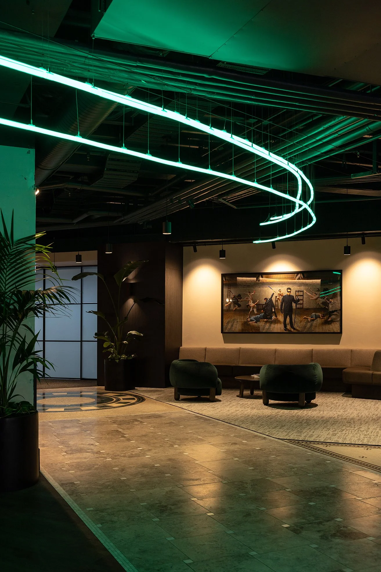
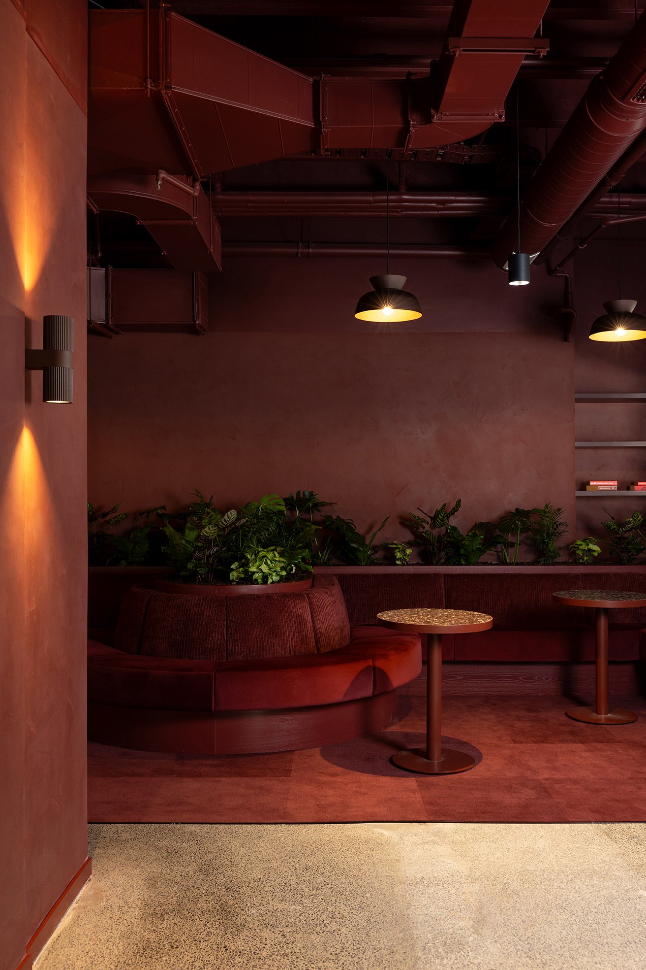
Achieving the desired atmosphere required careful consideration of lighting. With dark colours used extensively throughout the fit-out, functionality and mood needed to be balanced in equal measure.
"The main challenge has been to get the balance of lighting correctly. Due to the dark colours that are being used in the colour drenching, lighting was important to make sure the space is functional yet still retain the moody feel the client would like to achieve."
Through the considered use of colour, texture, decorative finishes, and lighting, the team at Catalyst has created a workplace that honours the building's heritage while expressing Kernel's confident and progressive brand identity.
Design & Build by Catalyst
-
PRODUCT Ambitec Suave
APPLICATION Walls
COLOUR Blanc, Resene Madagascar match and Brunette Match
FINISH Medium grade polish
_
Photography by Jono Parker
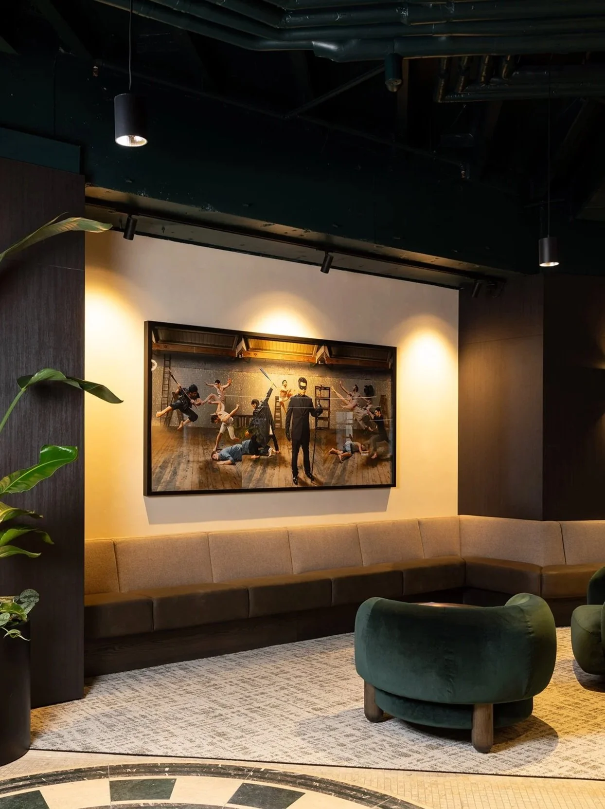
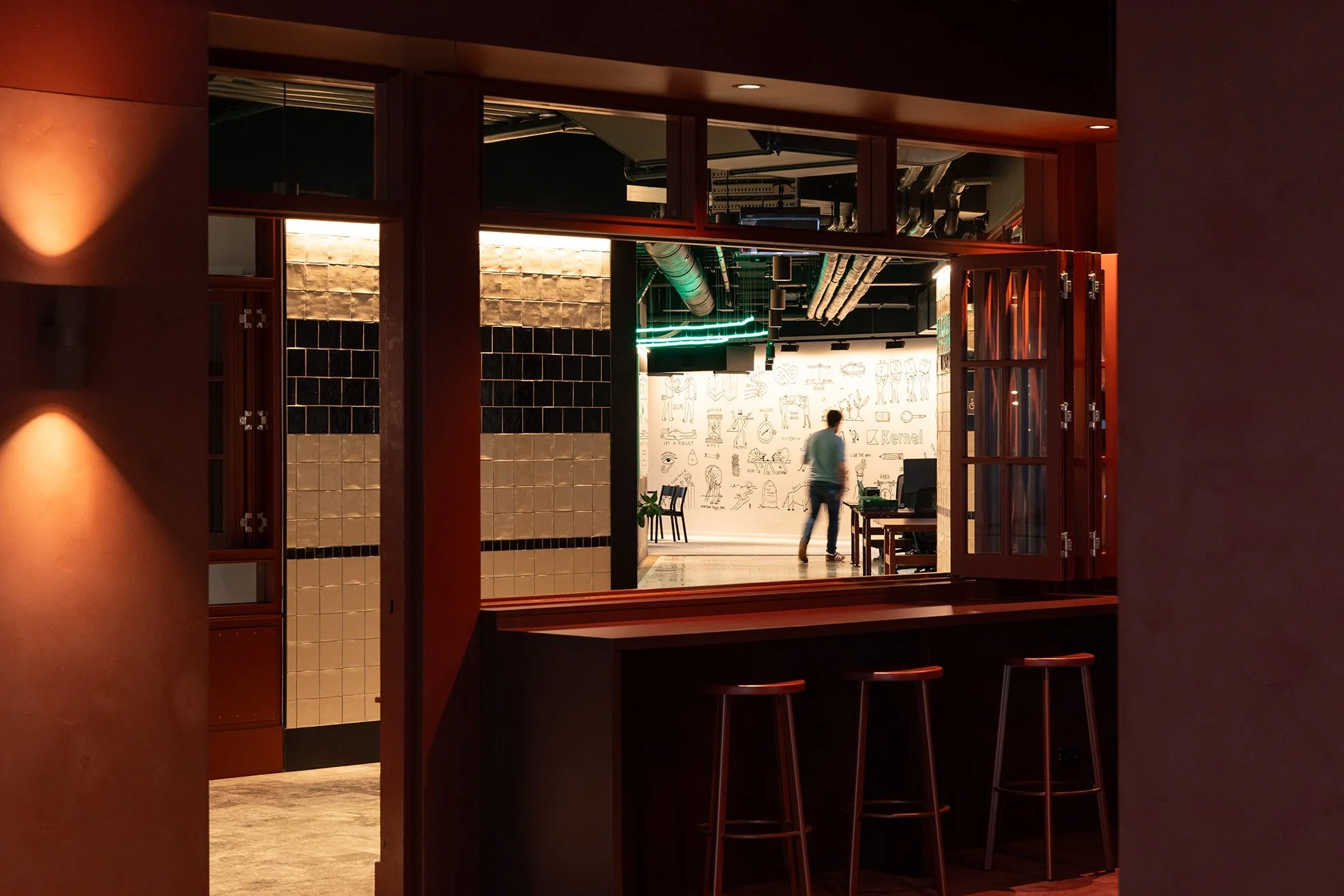
Designed by Catalyst, Kernel's workplace is located within Auckland's historic former BNZ headquarters at 125 Queen Street. Original plaster walls, mosaic flooring, exposed concrete columns, and heritage detailing provide a rich architectural backdrop for a contemporary workplace that reflects the bold identity of the fintech brand.
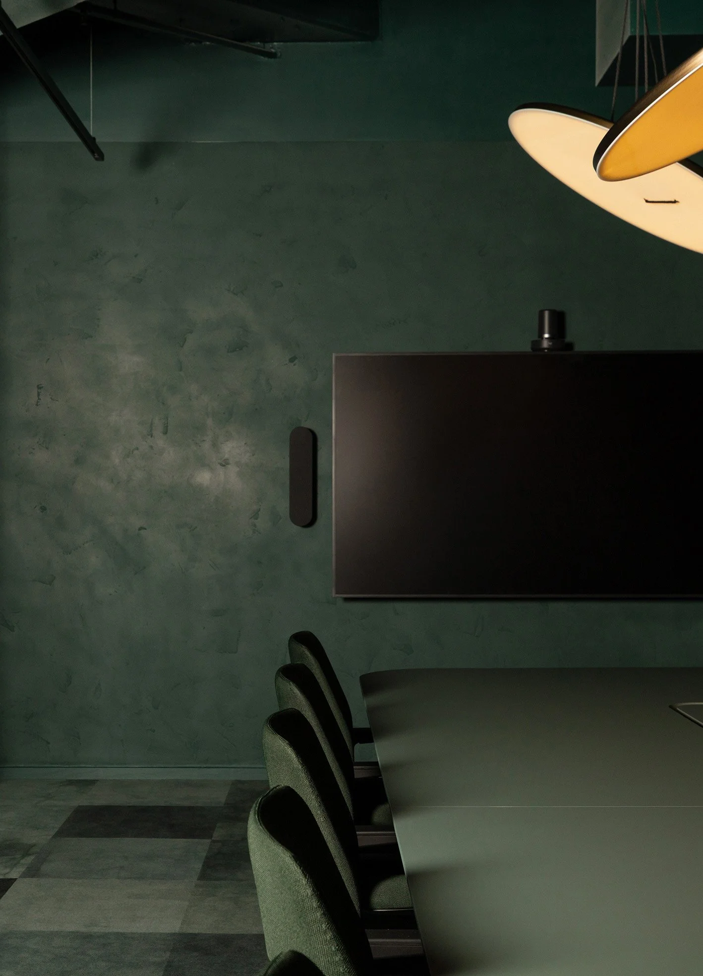
Colour plays a defining role throughout the interior design. Drawing on Kernel's signature palette, lead designer Stephanie Widjaja used deep green tones to create immersive, mood-driven environments.
"I used the client's signature dark green as the starting point. He was adamant in using the colour on the ceiling to create a dark moody feel."
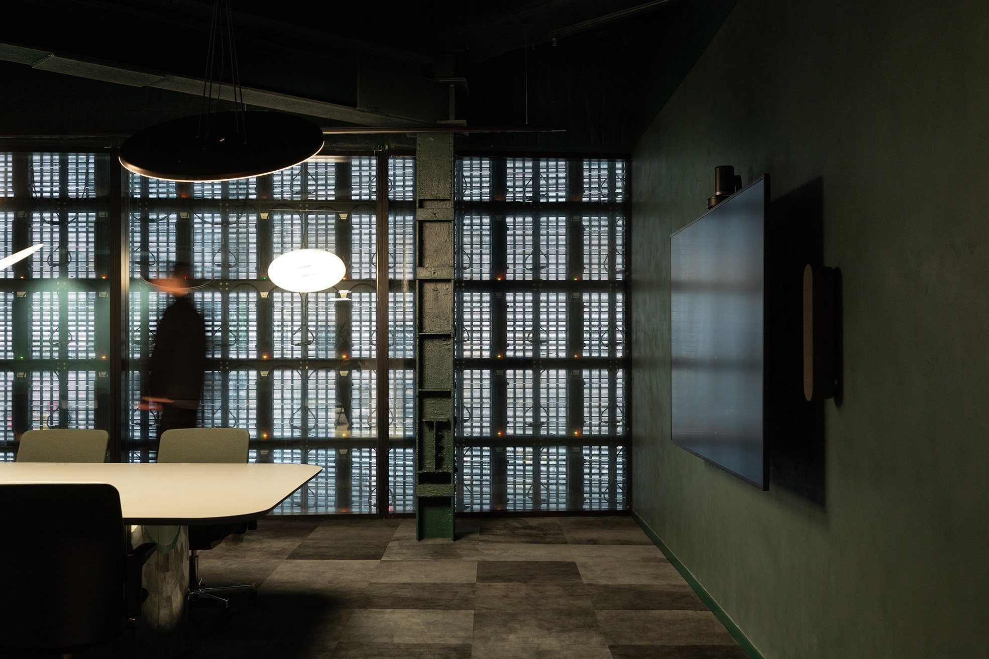
Building on this concept, colour drenching was used throughout key spaces, extending across walls, ceilings, joinery, and furniture to create a cohesive and engaging workplace experience.
"I then pushed the idea further in certain areas by colour drenching the whole room, across walls, ceilings, joinery and furniture, making the space feel immersive rather than simply branded. This technique allows the client's identity to come through in a bold way rather than doing it subtly."
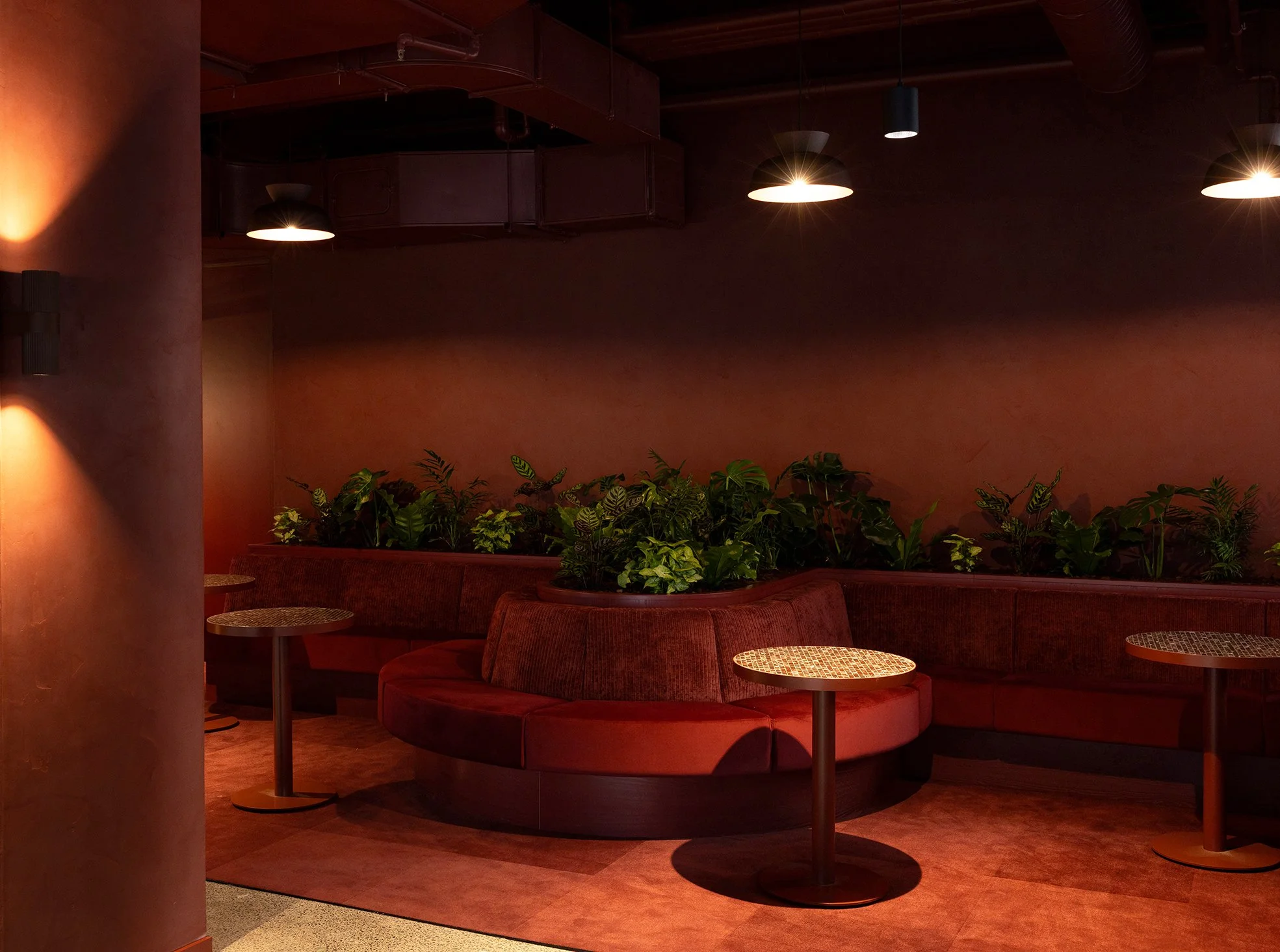
Bespoke decorative finishes add depth, texture, and materiality throughout the interior, working alongside the building's heritage character to create layered and memorable spaces. A standout example is the entertainment and presentation area, where deep red tones create a bold destination designed to capture attention and encourage engagement.
Finishes used

Suave - Resene Brunette match
Suave Blanc
Suave - Resene Madagascar match